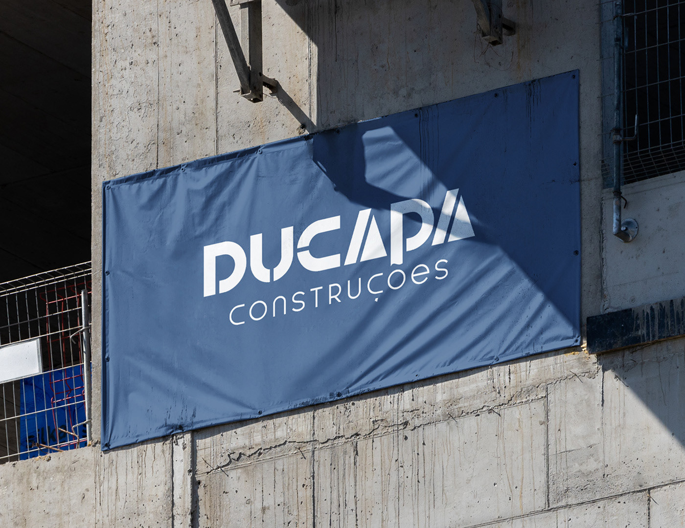
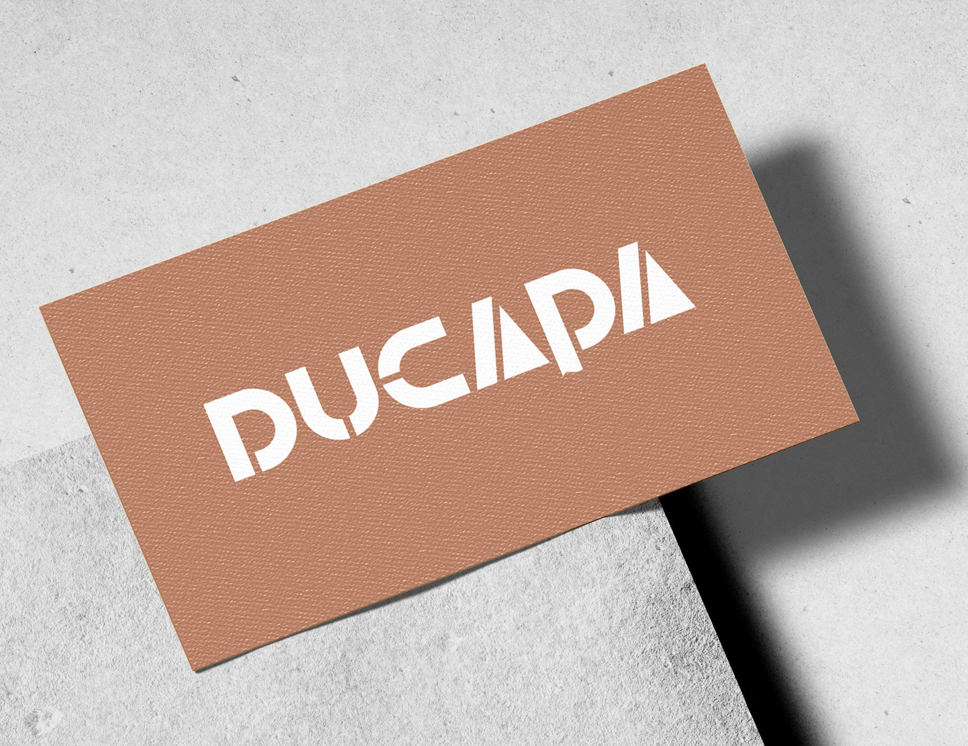
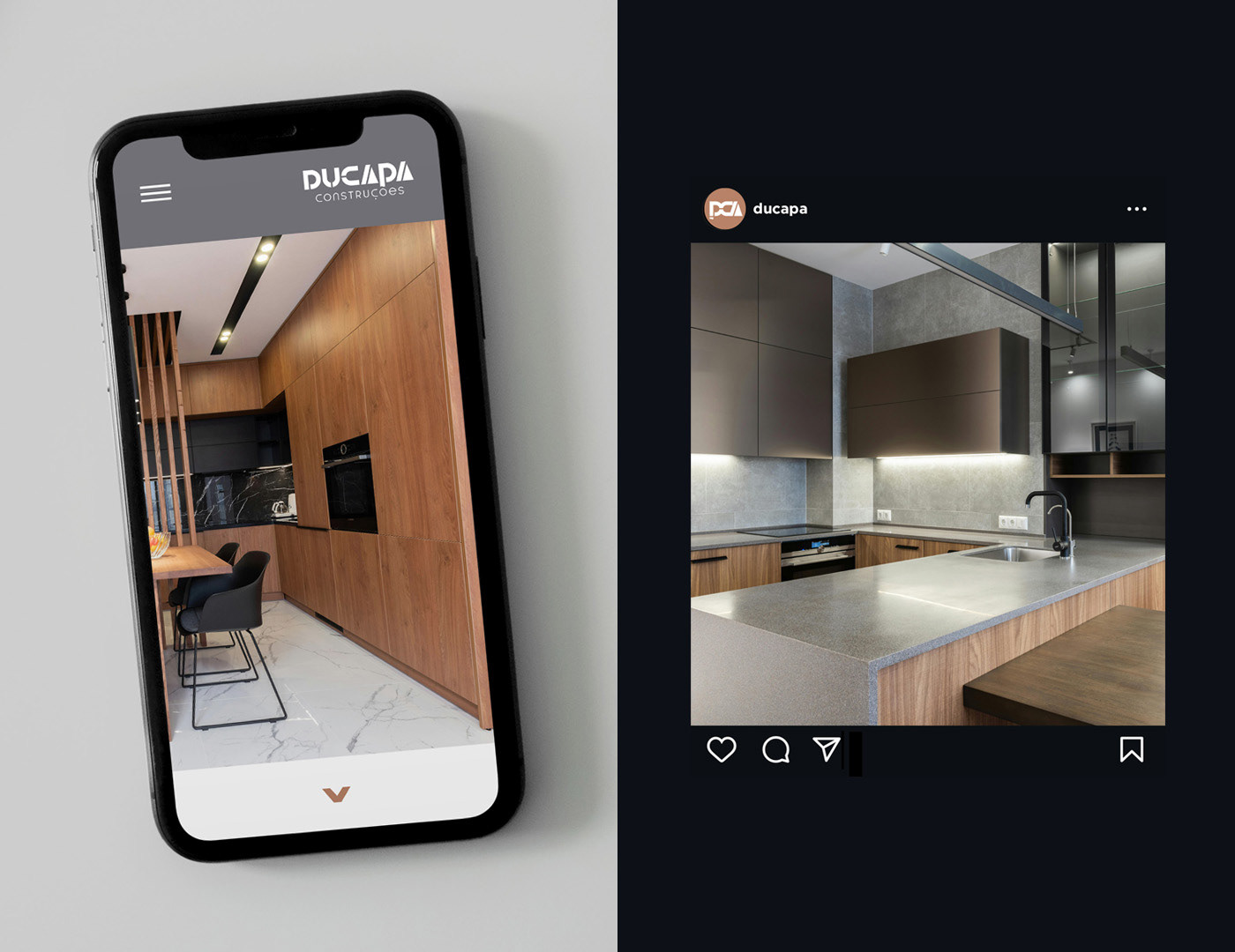
DUCAPA is a construction and renovations company committed to delivering solid, reliable, and high-quality results. The company was founded by three partners, Dufranne, Carvalho, and Patrick, with the name itself reflecting their union. The brand’s visual identity is thoughtfully designed to reflect these core values.

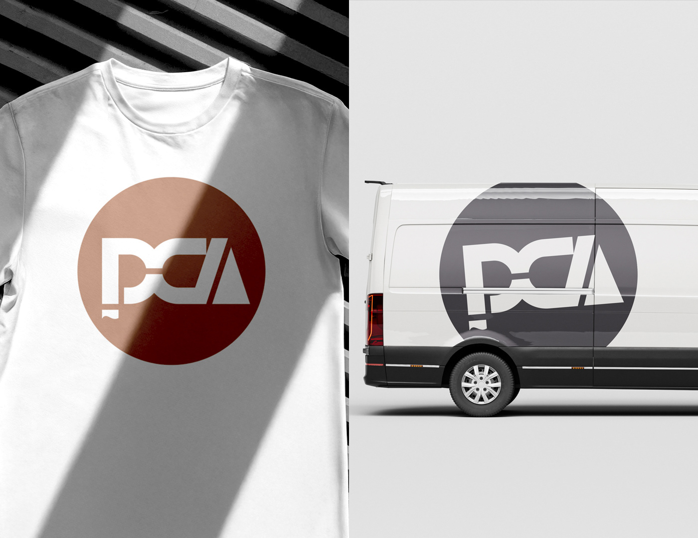
At the heart of the identity is a custom-designed typography that embodies strength, precision, and trust. The bold letterforms are crafted to feel sturdy and dependable, while subtle geometric elements add a modern, professional touch. The friendly yet powerful design approach ensures that DUCAPA appears both approachable and authoritative, ideal traits for a company that customers rely on for important building and renovation projects.
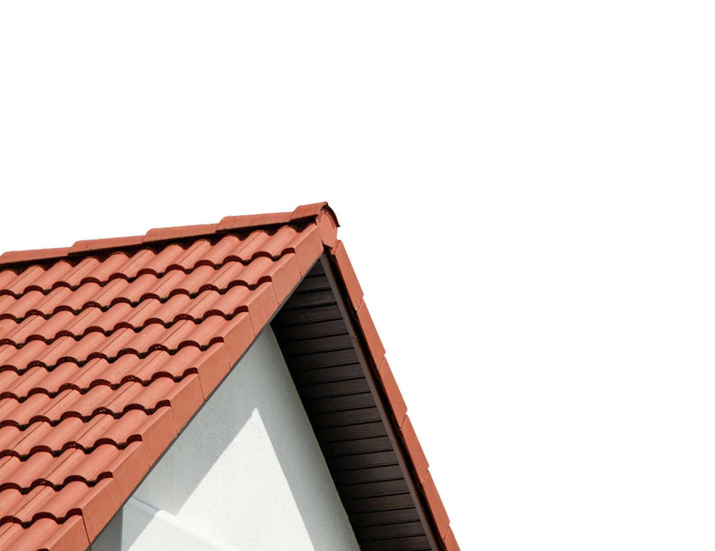
The graphic identity adds an extra layer of meaning and sophistication through the negative space between the “P” and the “O” in the word “Construções”, which forms the tile featured within the letter “O”. This element simultaneously evokes the image of a Mediterranean roof tile, symbolising the tradition and craftsmanship associated with house construction.
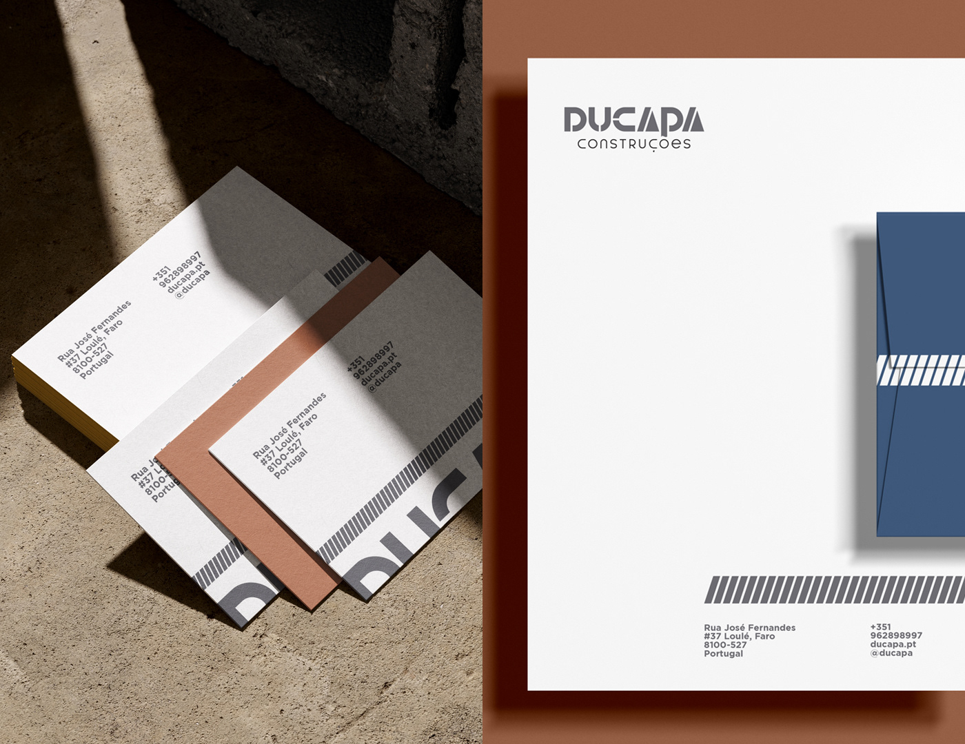

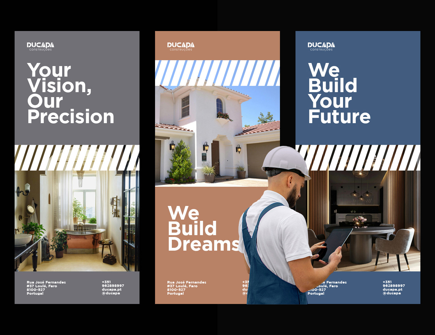

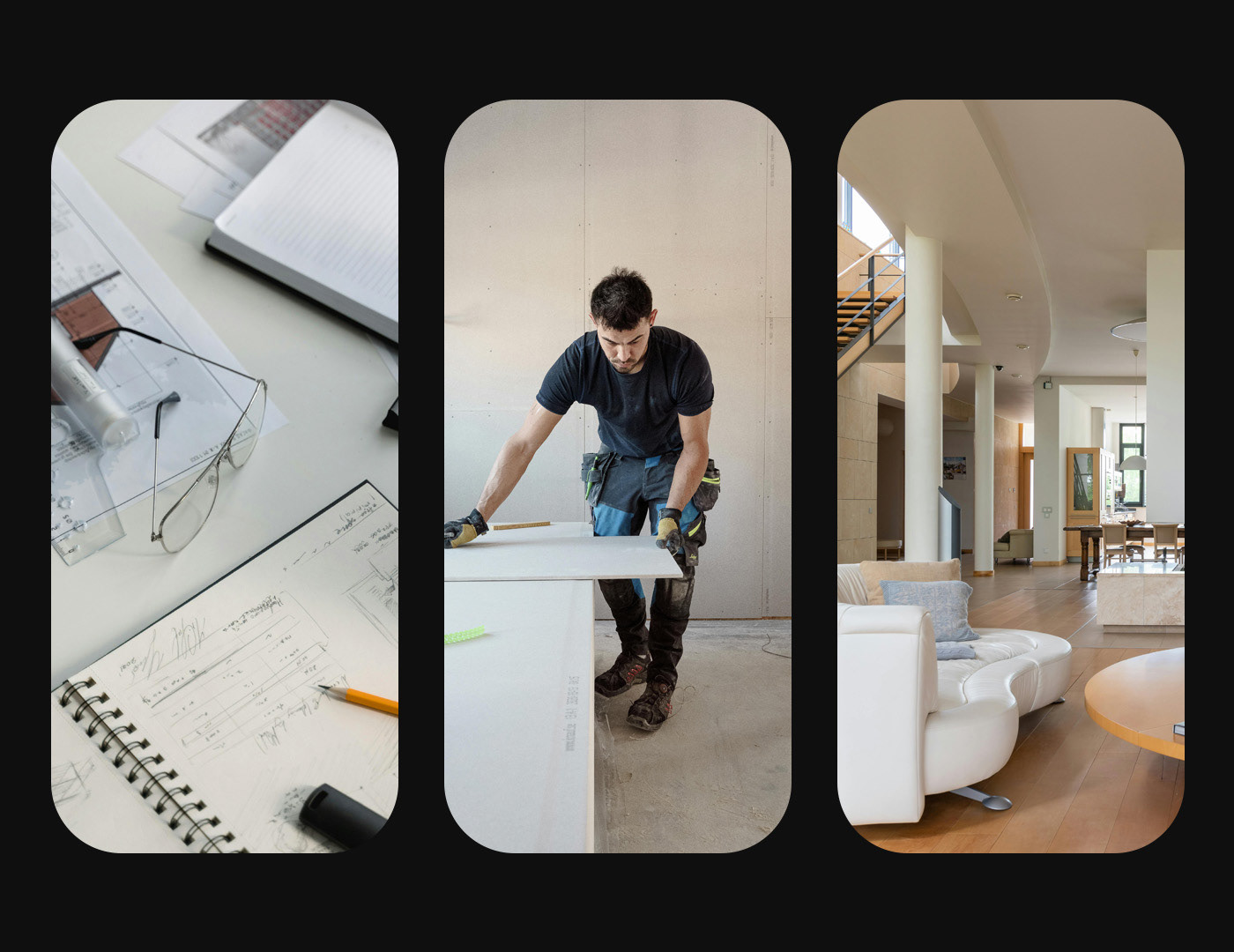
The visual system is clean, structured, and minimalistic, emphasizing clarity and craftsmanship. It communicates the company’s dual focus: building strong foundations and renovating spaces with care and innovation. Every design element, from the typography to the layout and color choices, is carefully aligned with DUCAPA’s mission to provide reliable construction solutions while fostering strong client relationships.
Through this identity, DUCAPA positions itself not just as a service provider, but as a trusted partner in every project.